
You use graphic design every time you choose a font, pick a color, or arrange a layout—so learning the basics gives you immediate power to shape clear visual communication. Mastering core principles like balance, hierarchy, color, and typography lets you create designs that guide attention, solve problems, and look professional.
This guide breaks down essential design elements and practical techniques so you can apply them in digital design projects right away. Expect concise explanations, actionable tips, and simple exercises that help you practice composition, color choices, and type decisions with confidence.
Key Takeaways
- Understand fundamental principles to improve the clarity and impact of your visual work.
- Learn how basic elements like color and typography control attention and tone.
- Use practical techniques and tools to apply concepts across digital design projects.
Core Principles of Graphic Design
These principles govern how you arrange visual elements so your message is clear and persuasive. They determine how viewers perceive importance, navigate content, and remember your design.
Balance and Visual Weight
Balance controls how visual weight distributes across a layout so the composition feels stable. You achieve this through symmetry—mirroring elements for formal balance—or asymmetry—offsetting a large shape with several smaller elements to create dynamic tension. Consider weight factors like size, color value, density, and texture; a small dark element can balance a larger light area.
Use grids to place elements consistently and test balance at different scales, especially for responsive layouts. White space acts as a counterweight: increasing it around a focal point can reduce perceived clutter and shift emphasis. Think in terms of visual axes and paths so weight guides the eye toward your intended focal points.
Contrast and Emphasis
Contrast makes important elements stand out so viewers quickly grasp hierarchy. You can create contrast with color value, scale, type weight, shape, and spacing. For example, a bold, high-contrast headline against muted body text establishes clear emphasis without extra decoration.
Apply emphasis by combining contrast techniques—use a larger size, stronger color, and increased white space together to mark a call to action. Maintain accessibility: verify color contrast ratios for legibility and avoid relying solely on color to convey critical information. Use contrast selectively; too many competing contrasts dilute emphasis and confuse the viewer.
Alignment and Proportion
Alignment organizes elements along common edges, centers, or baselines to create order and cohesion. When you align items, you create invisible guides that improve readability and make relationships between elements explicit. Use left alignment for long text blocks and center alignment sparingly for short headings or hero statements.
Proportion refers to the relative sizes of elements and supports hierarchy—larger objects read as more important. Set proportions using a consistent grid or modular scale so type sizes, margins, and image crops relate predictably. Keep proportions responsive: adjust element scale and spacing across breakpoints so the visual relationships stay intact on any screen.
Repetition and Rhythm
Repetition reinforces unity by reusing colors, shapes, type styles, and spacing so your design reads as a cohesive system. Establish patterns—consistent button styles, color accents, or header treatments—to speed recognition and strengthen brand identity. Combine repetition with variation to avoid monotony; small changes in size or color across repeated elements create interest.
Rhythm concerns the timing and spacing of repeated elements to produce flow. You can use regular rhythm (even spacing), progressive rhythm (gradual change), or flowing rhythm (curved or diagonal placement) to guide the eye through content. Use rhythm to control pacing: tighter spacing accelerates scanning, wider spacing slows reading and focuses attention.
Foundational Design Elements
These building blocks determine how viewers read, feel, and navigate your layouts. Pay attention to how each element — from line to white space — directs attention, defines hierarchy, and supports your message.
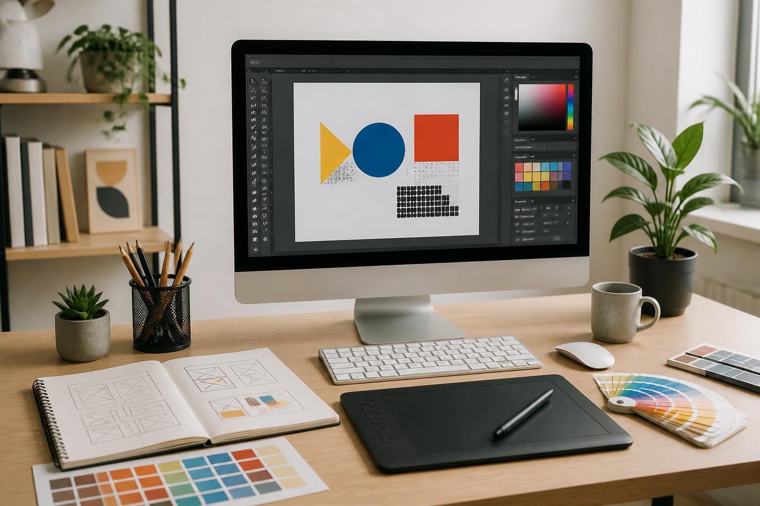
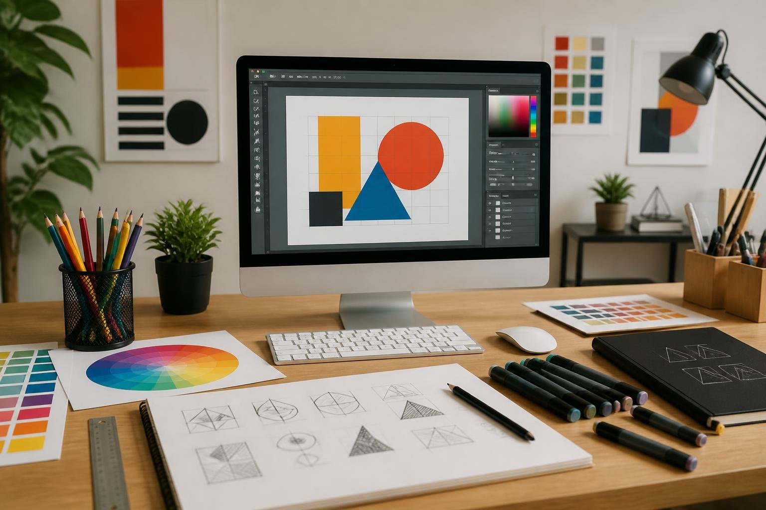
Lines and Shapes
Lines guide the eye and create relationships. Use horizontal lines for calm, vertical lines for stability, and diagonal lines for motion or tension. Thin lines work well for subtle separators; thick lines establish strong boundaries or emphasize elements.
Shapes create recognizable units in your composition. Geometric shapes (circles, squares, triangles) communicate structure and predictability. Organic shapes suggest natural, human, or hand-drawn qualities. Combine shapes to form icons, buttons, or background patterns that reinforce function and brand.
Think of lines and shapes together: an outline (line) defines a button (shape), while intersecting lines can create a grid that aligns content. Apply contrast in weight and scale to establish hierarchy and improve scanning.
Forms and Texture
Form adds perceived depth to flat shapes. Use shading, gradients, or subtle drop shadows to suggest volume on buttons, cards, or illustrations. Keep lighting consistent across components to maintain a cohesive spatial logic.
Texture introduces tactile cues without adding actual weight. Subtle grain, paper-like textures, or brushed finishes can convey warmth or craft. Use texture sparingly on interfaces to avoid visual noise; reserve stronger textures for print or hero imagery where detail supports the message.
Balance form and texture so they support usability. Overuse can reduce legibility and compete with content. Test contrast and touch targets to ensure textures don’t interfere with interaction or readability.
White Space and Negative Space
White space is active space you leave around elements. Use it to group related items, separate sections, and improve legibility. Increasing padding around headlines and paragraphs boosts comprehension and perceived quality.
Negative space shapes composition by defining the relationship between objects. You can create implied shapes or focal points with empty areas — for example, a logo surrounded by generous negative space reads as high-end. Negative space also helps create rhythm and pacing in multi-column layouts.
Control white space through margins, line-height, and grid gutters. Don’t remove space to force content; instead, adjust type size or layout columns. Proper use of white and negative space simplifies navigation and strengthens your design composition.
Mastering Color in Graphic Design
Color choices shape how viewers perceive your work, communicate brand identity, and guide attention. Learn practical rules for mixing hues, building palettes that match your goals, using contrast for legibility, and choosing colors that support the emotion or trust you want to create.
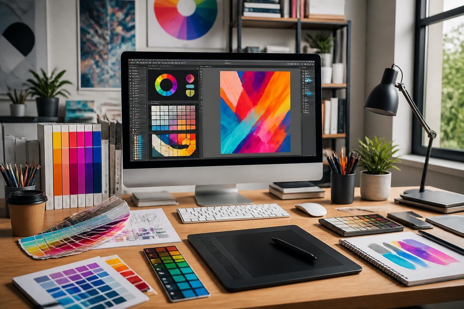
Color Theory and the Color Wheel
Color theory gives you predictable ways to combine hues. The color wheel organizes primary, secondary, and tertiary colors so you can select relationships (analogous, complementary, triadic) that create harmony or tension.
Understand hue, saturation, and value. Hue identifies the color family, saturation controls intensity, and value sets lightness. Use these three properties to adjust mood without changing the core hue.
Work in the right color model for your output. Use RGB for screens and CMYK for print. Convert early so palettes remain consistent across media and avoid unexpected shifts during production.
Color Palette and Harmonies
A strong color palette starts with a dominant color, one or two accents, and a neutral base for text and backgrounds. Pick a primary color tied to your brand identity, then choose accents that either contrast or support it.
Apply harmony systems: analogous palettes feel cohesive and calm; triadic palettes deliver balanced energy; tetradic or square palettes offer variety but need careful value control. Use tints and shades to expand a palette without adding new hues.
Tools like Coolors or color pickers speed testing. Export palettes with hex, RGB, and CMYK values to keep consistency across designers, developers, and printers.
Contrast and Complementary Colors
Contrast determines readability and visual hierarchy. Use high contrast between text and background for legibility—typically dark text on a light background or vice versa. Test contrast ratios for accessibility (aim for WCAG AA or AAA where required).
Complementary colors sit opposite on the color wheel and amplify each other when placed together. Use them sparingly as accents to create focal points. Beware of using saturated complements at equal value; they can vibrate and strain the eye.
Balance contrast with harmony: lower saturation or adjust value to maintain visual comfort while preserving distinction between elements.
Color Psychology
Color psychology links hues to common emotional and cultural associations, helping you align design with user expectations. Blue often conveys trust and calm; red signals urgency or passion; green suggests growth or sustainability.
Match color choices to audience and context. For financial brands, prioritize blues and neutrals to communicate stability. For creative products, introduce brighter accents to signal energy and innovation.
Test color choices with real users and across cultures. Interpretations vary by region, age, and industry, so validate assumptions with A/B tests or quick surveys before finalizing core brand colors.
Typography Fundamentals
Good typography makes text legible, establishes visual hierarchy, and communicates brand identity through measured choices in typeface, spacing, and size. Focus on clear reading at the intended display size, distinct levels of emphasis, and consistent rhythm across your layouts.
Readability and Hierarchy
Readability depends on type size, line length, contrast, and letterforms. Choose sizes that suit the medium: body text typically sits between 14–18px for web and 9–12pt for print. Keep line length between 45–75 characters to avoid visual fatigue. Use high color contrast—aim for a contrast ratio of at least 4.5:1 for body text—to ensure legibility in varied lighting.
Hierarchy guides readers through content using scale, weight, and spacing. Create at least three levels: primary (titles), secondary (subheads), and tertiary (body/captions). Use larger sizes, stronger weights, or unique styles for primary elements and reserve bold or colored accents for calls to action. Apply consistent rules (e.g., H1 = 32px/700, H2 = 24px/600, body = 16px/400) to maintain predictable rhythm.
Practical checklist:
- Body font size and line length fixed per breakpoint.
- Contrast tested against accessibility tools.
- Clear scale map for headings and captions.
Kerning, Tracking, and Leading
Kerning adjusts space between specific letter pairs to fix visually awkward gaps. Use kerning sparingly for headlines and logotypes where pair shapes create noticeable holes or collisions. Tracking modifies spacing uniformly across a range of characters; tighten tracking for compact headlines and loosen slightly for all-caps to preserve legibility.
Leading (line-height) controls vertical rhythm and affects how easily the eye moves between lines. For body copy, set leading to about 120–150% of the font size (e.g., 16px font → 19–24px line-height). Tight leading suits large display type but avoid overlaps; loose leading can hurt cohesion and break the reading flow.
Quick rules:
- Apply manual kerning for display text only.
- Use tracking adjustments globally for style changes.
- Start body leading at 1.4 and tweak for typeface x-height and line length.
Font Choices and Brand Voice
Your font choices should reinforce brand identity: select typefaces that match the personality you want to express. Sans-serifs often read modern and clean; serifs convey tradition and authority; slab serifs and display types offer distinctive character for headlines. Limit your system to 2–3 complementary families: one for headings, one for body, and an optional accent.
Consider technical constraints: web-safe or variable fonts improve performance and consistency across devices. Pair fonts by contrast—combine a neutral body face with a distinctive headline—and check for matching x-heights and similar character widths to avoid jarring shifts.
Brand implementation tips:
- Create a typography scale and document weights/styles.
- Define usage rules for logos, buttons, and long-form text.
- Test voice by applying type to real content: headlines, captions, and UI elements.
Applying Composition and Layout
Good composition arranges elements to guide attention, create balance, and support your message. Practical choices about spacing, alignment, and emphasis determine how quickly users understand and act on what they see.
Design Composition Strategies
Start by defining the primary purpose of the design: inform, persuade, or direct action. Use a grid to place elements consistently; columns and gutters speed alignment and make responsive adjustments predictable. Combine symmetry for stability with asymmetry for interest—place a dominant image on one side and balance it with white space and smaller text blocks on the other.
Apply negative space intentionally to isolate key elements and reduce visual clutter. Limit fonts to two complementary families and set clear type scales so headings, subheads, and body text read at a glance. Use color sparingly: one dominant hue for brand or focal elements, a contrasting accent to draw attention, and neutral tones for backgrounds.
Visual Hierarchy and Proximity
Decide which element should register first, second, and third. Use size, weight, color contrast, and placement to establish that order. Larger, bolder items with high contrast become focal points; secondary information gets medium weight and muted colors.
Group related items using proximity to form clear visual units. Place labels close to their controls, cluster navigation links, and keep captions near images. Consistent spacing and alignment signal relationships faster than explicit lines or boxes. Create a simple checklist to test hierarchy: can a viewer locate the main offer, supporting details, and next step within three seconds?
Movement and Call to Action
Use directional cues to create movement that leads the eye toward your call to action (CTA). Arrows, gaze direction in photos, leading lines, and staggered element placement all steer attention. Animate subtly—microinteractions, hover states, or sequential reveals—to increase noticeability without overwhelming users.
Design CTAs with high contrast, clear labels (e.g., “Buy Now,” “Get Quote”), and affordance (button shape, shadow). Place CTAs where the hierarchy naturally ends: at the right edge of a card, below a convincing headline, or opposite an image that points at it. Test placement and copy with quick A/B variations to measure click-through and refine movement strategies.
Essential Tools and Software
You need a mix of pixel editors, vector apps, and interface-focused tools to handle logos, layouts, UI, and social media graphics. Choose tools that match your workflow—photo retouching and motion work require different apps than wireframing and prototyping.
Industry-Standard Tools: Adobe Photoshop and Illustrator
Adobe Photoshop handles raster work: photo editing, compositing, texture creation, and preparing assets for motion graphics. Use Photoshop for color correction, layered mockups, and exporting multi-resolution images for social and web. Learn non-destructive workflows (adjustment layers, smart objects) to preserve originals.
Adobe Illustrator covers vector tasks: logo design, icon systems, and editorial layout elements that must scale. Master the Pen tool, precise type controls, and artboards for exporting SVGs or PDF print files. Combine Illustrator artwork with Photoshop textures when you need high-resolution finishes.
Both apps integrate with Adobe Creative Cloud libraries, letting you share swatches, symbols, and linked assets between projects. Use consistent color profiles and export presets to keep UI and print assets predictable.
Popular Alternatives: Canva, Figma, and Sketch
Canva speeds production of social media graphics and templates when you need quick, brand-consistent posts. It’s template-driven with accessible type and asset management; use it for marketing assets if you prioritize speed over custom vector work.
Figma targets UI design, UX workflows, and collaborative prototyping. Build responsive components, create interactive prototypes, and hand off specs to developers with measurements and CSS snippets. Its cloud-based multiplayer editing makes it ideal for design teams and design systems.
Sketch remains strong for macOS-based interface work, especially for component libraries and plugin-driven workflows. Pair Sketch or Figma with user-testing tools and use wireframes and constraints to plan responsive interfaces. For vector-only projects where you want local control, Sketch or Figma can replace Illustrator.
Other Useful Resources and Trends
Affinity Designer and Inkscape provide capable, lower-cost vector alternatives for logo and editorial design. Use Affinity for a one-time purchase workflow and Inkscape for open-source SVG work. GIMP can handle raster editing when Photoshop isn’t available, though its UX differs.
Adopt tools like Coolors for palette generation and integrate Pantone or calibrated monitors for color-critical print and editorial work. For motion or advanced compositing, add After Effects or similar apps into your toolkit.
Track trends: component-driven design, interactive prototypes, and AI-assisted asset generation are shaping workflows. Keep a toolbox that covers logo design, editorial layouts, wireframes, UI/UX prototypes, and exporting optimized assets for social media and web.