
You can launch a focused web presence in minutes with a mini landing page that highlights one offer, captures contacts, or drives a single action without the distractions of a full site.
Think of it as a lightweight, high-converting web page that puts your call to action front and center and works well across mobile and desktop.
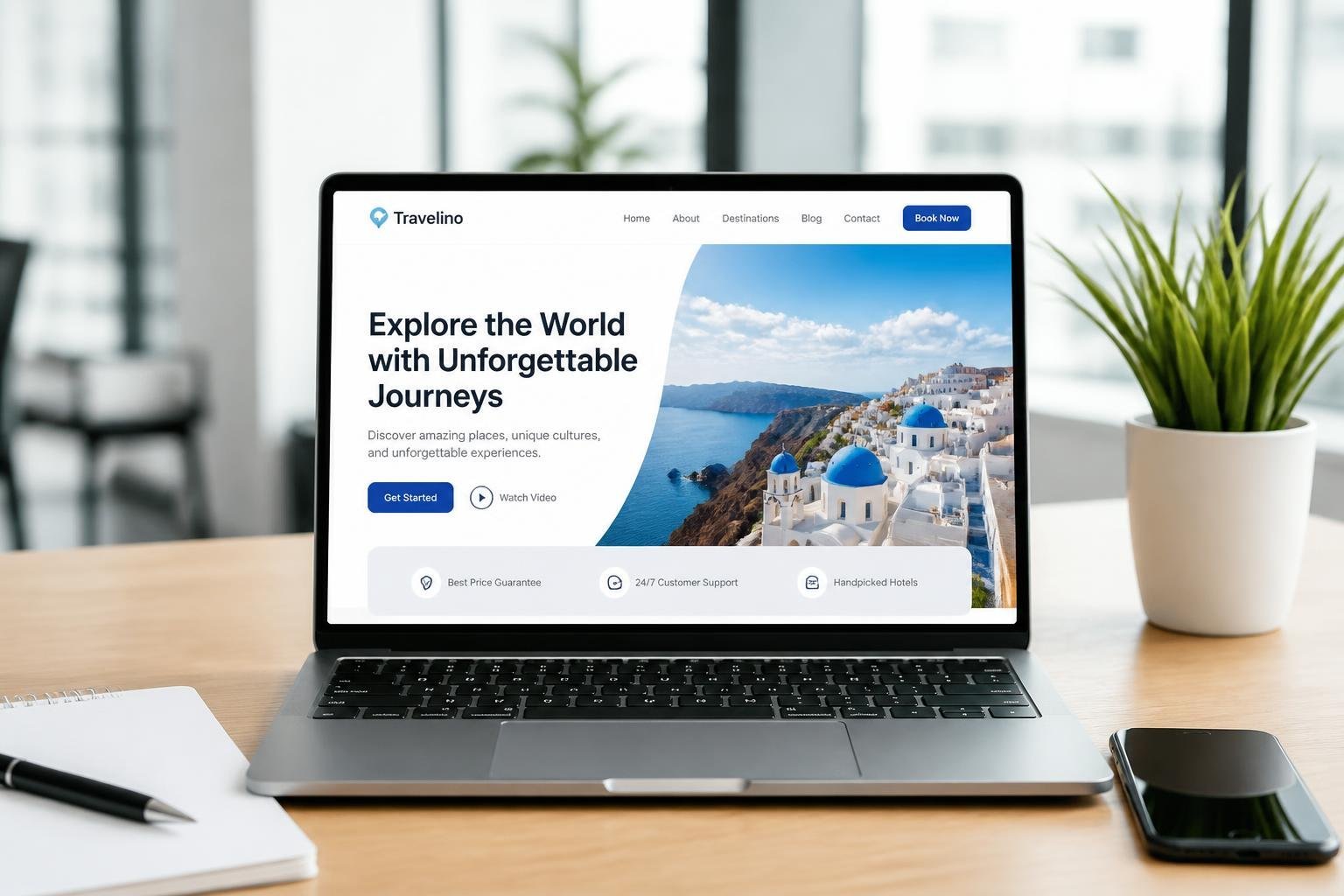
A well-designed mini landing page converts faster by presenting a clear message, a single goal, and an easy path for visitors to take action.
You’ll learn how to choose the right layout, what elements boost trust and clicks, and which use cases make mini landing pages the smartest move for promos, signups, and link-in-bio needs.
Key Takeaways
- Use a focused, single-goal layout to improve conversion.
- Include essential trust signals and a clear call to action.
- Pick a template or builder that matches your purpose and publishing speed.
Core Features and Benefits
Mini landing pages focus on speed, clarity, and a single measurable outcome. They reduce friction for visitors, capture the specific data you need, and drive action with a tight visual and copy hierarchy.
Fast Deployment Advantages
You can publish a mini landing page in hours rather than weeks. Templates and modular blocks let you assemble a responsive landing page that adapts to phones and tablets without extra coding.
That speed shortens campaign cycles. You can A/B test headlines, images, and single call to action (CTA) placements quickly, then iterate based on real conversion data.
Fast deployment also lowers cost and risk. You avoid long development sprints, launch time-sensitive offers, and roll back changes easily if a variant underperforms.
Lead Capture Capabilities
Design the page to capture leads with a single, clear objective: collect one primary piece of information (email, phone, or form submission). Limiting fields increases completion rates and reduces drop-off.
Use progressive capture when you need more data over time—start with an email, then request phone number or preferences in follow-up flows. Pair the form with trust signals like short testimonials or a privacy note to boost conversions.
Integrate the form with your CRM or email tool to automate follow-up. That enables immediate nurture sequences, segmentation, and measurable ROI on the captured leads.
Optimized Call to Action Elements
Place one primary CTA above the fold and repeat it strategically down the page. Make the CTA text action-oriented and specific, such as “Get Your 7‑Day Trial” or “Reserve a Demo Slot.”
Design CTAs with contrasting color, clear affordance (button shape and size), and microcopy that reduces hesitation—deadline, limited spots, or refund policy. Buttons should be large enough for thumbs on mobile.
Measure CTA performance with click-through and conversion tracking. Use variant testing on wording, color, and placement to find the combination that yields the highest conversion rate for your audience.
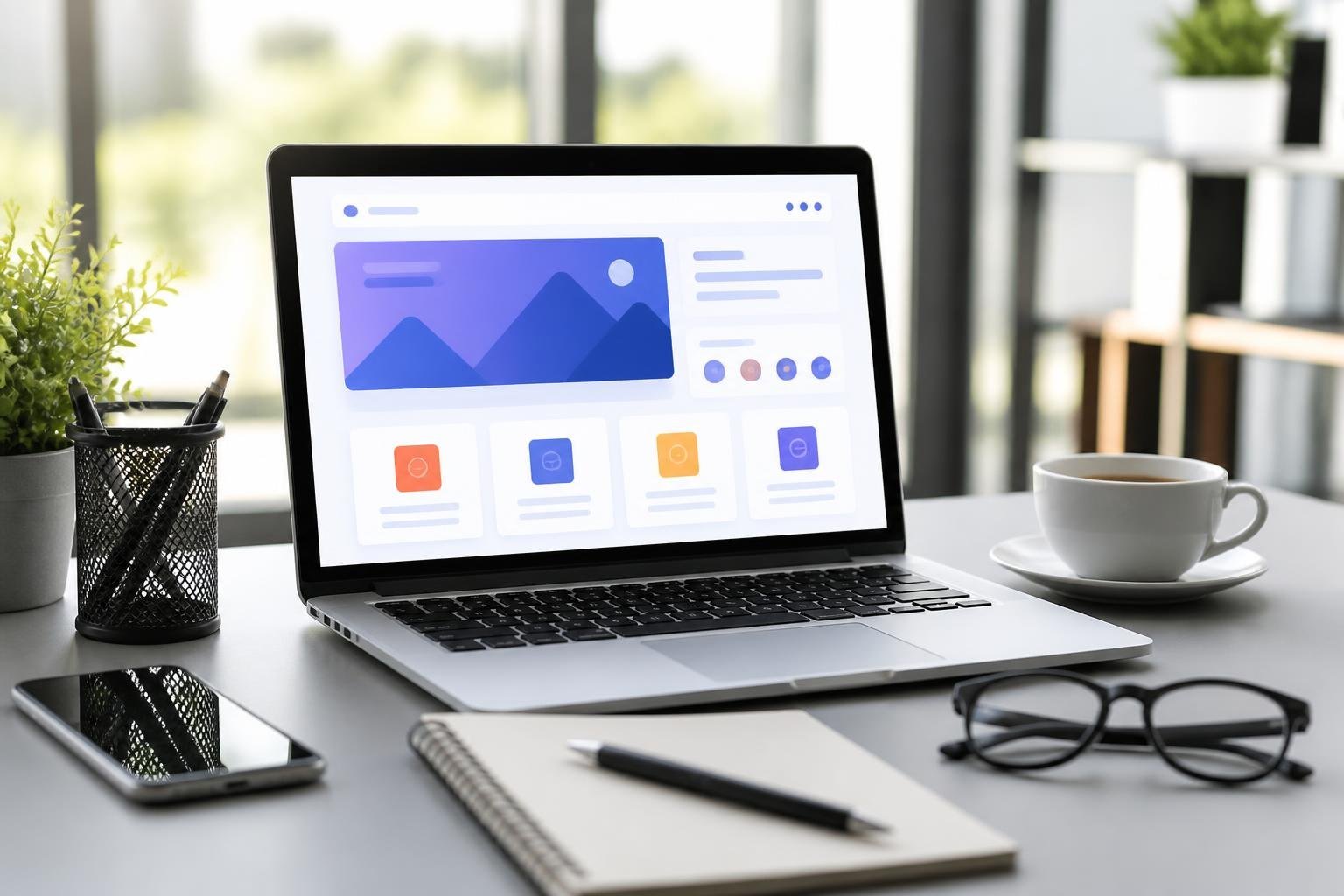
Selecting the Right Mini Landing Page Design
Choose a design that matches a single conversion goal, uses concise messaging, and prioritizes performance and mobile experience. Focus on the visual hierarchy, CTA prominence, and which elements (portfolio, product, or brand) must carry your message.
Modern vs. Minimal Styles
Modern layouts use bold typography, full-width imagery, and interactive micro‑animations to convey energy and product capability. Pick modern when you need to showcase product features, motion, or multiple use cases in a compact space. Ensure animations are subtle and don’t delay load times; fast rendering keeps conversions steady.
Minimal styles rely on whitespace, short benefit-driven headlines, and a single clear CTA. Choose minimal when you want frictionless signups or purchases—examples include trial signups or focused lead capture pages. Minimal designs reduce cognitive load, so tighten copy to a single value proposition and remove secondary links.
Match style to audience expectations. If your audience values polish and innovation, use modern. If they want speed and clarity, use minimal. Test one variable at a time: headline, hero image, or CTA color.
Portfolio and Product-Focused Layouts
A portfolio landing page centers visual work and case snippets. Lead with a prominent image or short gallery, followed by 1–3 key outcomes or metrics that validate your claims. Use client logos and a concise testimonial to build trust without crowding the page. Link portfolio items to lightweight overlays or modal view to avoid abandoning the conversion path.
A product landing page emphasizes benefits, pricing or CTA, and quick feature scannability. Use a hero with a single benefit line, one primary CTA, and 3–4 compact feature blocks with icons. Include a short demo or GIF to show the product in action; keep it muted and autoplay-disabled on mobile. Place pricing or trial info close to the CTA so visitors don’t need to hunt for purchase cues.
Both layouts must be optimized for mobile. Prioritize stack order: headline → hero visual → benefits → CTA. Keep forms short and use progressive disclosure for extra details.
Effective Use of Visuals and Branding
Use visuals to support one clear message: choose a single hero visual that demonstrates the outcome you promise. For product landing pages, use real screenshots or short demos. For portfolio pages, show high-resolution case images cropped to highlight the work’s result. Avoid generic stock photos that dilute credibility.
Apply branding consistently: color palette, typography, and CTAs should match your broader brand but be simplified for the mini landing page. Use contrast to make the CTA stand out; a single accent color for actions works best. Include a small trust element—logo strip or brief testimonial—near the CTA to reduce hesitation.
Optimize images for load: use modern formats (WebP/AVIF), set width-appropriate sources, and lazy-load non-essential visuals. This preserves fast first contentful paint and keeps your mini landing page conversions intact.
The Role of Templates in Mini Landing Pages

Templates give you a ready-made structure, visual hierarchy, and conversion-focused elements so you can launch a mini landing page quickly and consistently. They handle responsive layout, CTA placement, and basic SEO metadata, letting you focus on copy, offer, and testing.
Benefits of Pre-Built Page Templates
Pre-built landing page templates cut development time and reduce design decisions you must make. You get tested layouts for hero sections, benefit bullet lists, social proof blocks, and single-focus CTAs that work well for product landing page templates and app landing page template use cases.
Many templates are responsive landing page templates out of the box. That ensures buttons, form fields, and images scale correctly on phones, tablets, and desktop without extra coding. You avoid common mobile friction points like tiny CTAs or oversized images.
Templates also simplify A/B testing. Use two templates with the same offer and compare headline placement, image size, or form length to find the highest-converting structure. This makes iterative optimization faster and more systematic.
Customization and Flexibility
You still control brand voice, imagery, and conversion elements when using templates. Change headlines, swap hero images, edit button copy, and adjust form fields to match your funnel goals. Tailor a product landing page template to highlight features or an app landing page template to promote downloads.
Good templates expose layout blocks so you can add or remove sections without breaking responsiveness. That flexibility lets you create a short, single-CTA mini landing page or a slightly longer page with testimonials and feature tiles.
If you need advanced tweaks, templates built on common page builders or frameworks allow CSS overrides and custom scripts. That makes it possible to keep template speed while implementing analytics events, payment buttons, or messenger links that fit your conversion flow.
Showcasing Free and Paid Options
Free landing page templates provide a low-cost way to test offers and validate ideas quickly. They often include core structures—hero, benefits, CTA, and footer—that work for many industries. Use free templates for MVPs, limited campaigns, or internal tests.
Paid templates add polish, specialized components, and ongoing support. You’ll find premium product landing page templates with built-in pricing tables, animation, and optimized checkout flows. Paid choices also tend to include multiple responsive landing page template variants for different industries.
Consider a hybrid approach: start with free landing page templates to validate, then migrate to a paid or custom page template once metrics justify investment. That way you balance speed, cost, and the refined capabilities you need for sustained conversion improvements.
Building and Publishing a Mini Landing Page
You will pick a builder that fits your technical skill and campaign needs, follow a concise creation flow, and add forms and tracking to capture and measure leads.
Choosing the Best Landing Page Builder
Choose a builder based on templates, mobile responsiveness, and publishing options. If you need a simple one-page site, pick a tool like Carrd or Canva for fast setup and responsive templates. For richer micro websites with sub-sections or multimedia, consider platforms that support minisites and blocks (FlipHTML5, Vista Page) or page builders with drag-and-drop and prebuilt conversion sections.
Compare these features in a quick checklist:
- Templates and blocks for CTAs, pricing, testimonials
- Custom domain and subdomain support
- Mobile-first previews and AMP or fast-loading output
- Built-in forms or integration with your CRM/email provider
- Analytics and conversion tracking support
Budget and speed matter. Use free builders for single campaigns and paid tools when you need advanced integrations, A/B testing, or white-label domains.
Step-by-Step Creation Process
Start with a clear objective: one primary CTA and a single conversion event. Draft a short wireframe: headline, value bullets, social proof, offer details, and CTA.
Next, pick a template that matches your wireframe. Replace placeholder copy and images with on-brand assets sized for web performance. Keep navigation minimal—use anchor links or a sticky header if you need sections like Features or Pricing.
Optimize for mobile: test tap targets, font sizes, and load speed. Use lazy-loading for images and compress media. Set up SEO basics: title tag, meta description, and a focused URL slug that matches your keyword intent. Finally, preview on multiple devices and publish to a custom domain or subdomain tied to your main site.
Integrating Forms and Tracking
Add a form that maps fields to your CRM or email tool; keep it short to reduce friction. Typical fields: name, email, and one qualifying question. Offer an incentive like a PDF or discount and deliver it via an automated email.
Set up tracking for every conversion touchpoint. Implement Google Analytics (or GA4), Facebook/Meta pixel, and UTM parameters on ad links. Configure a conversion event for form submits and button clicks. If your builder supports native analytics, sync it with third-party tools to avoid data gaps.
Test the full flow: submit the form, confirm lead capture in your CRM, and verify conversion events fire in analytics. Maintain a tracking checklist:
- Form → CRM field mapping
- Thank-you page or event for conversions
- UTM tagging on paid links
- Pixel and analytics verification in real time
This ensures you can both collect leads and measure which channels drive the best results.
Popular Use Cases and Industry Examples
Mini landing pages excel when you need a focused, fast-loading page that drives a single action. They work best for short campaigns: capturing sign-ups, showcasing one product, or collecting leads with minimal friction.
App and Mobile Product Launches
Use a mini app landing page to present your product’s core value in one glance. Lead with a concise hero headline, a short feature bulleted list, and a single CTA like “Download” or “Join Beta.”
Include 1–2 screenshots or a short autoplay demo to show the UI quickly without slowing load time.
Prioritize platform badges (App Store, Google Play) and one clear trust signal—press quote, rating, or user count. If you run a prelaunch, add an email capture or waitlist form and an indicator of limited spots to increase urgency.
Track installs and sign-ups via UTM-tagged buttons and a single conversion goal in your analytics.
Coming Soon and Event Announcements
A coming soon landing page should convert curiosity into contact details. Use a bold launch date, a one-line benefit statement, and an email form or SMS opt-in as the primary action.
Offer a tangible incentive—early access, discount code, or an invite—to boost conversions.
Add a minimal countdown clock and one secondary CTA to follow social channels. Keep copy tight: two short bullets on what users will gain and one testimonial or partner logo if available.
Integrate with your CRM or email provider to auto-segment early sign-ups for targeted prelaunch messaging.
Real Estate and Ecommerce Solutions
For a real estate landing page, highlight one asset per mini page: a hero photo, 3 quick specs (beds, baths, sqft), and a lead form for showings or brochure download.
Use a map pin, price, and a one-sentence selling point to help prospects decide fast.
For ecommerce, create product-focused mini landing pages that feature a single SKU or limited collection. Include a crisp product title, one benefits list, and a prominent “Buy Now” or “Pre-order” CTA.
Add one social proof element (review score or short testimonial) and a clear returns/shipping policy link. Use variant selection sparingly to prevent form friction and keep load times low.
Frequently Asked Questions
This section answers practical questions about compact landing pages: what distinguishes a micro landing page, the core elements that drive conversions, where to find templates, and how tools like Canva and AI can speed design and copy. Expect clear, actionable guidance you can apply to build a focused one-page experience.
What is a micro landing page, and how is it different from a full landing page?
A micro landing page (also called a mini or one-page landing page) focuses on a single offer or action—signup, download, or sale—on a single scrolling page.
Full landing pages or multi-page funnels often include broader navigation, multiple sections, and additional supporting pages (pricing, features, blog), while micro pages minimize choices to reduce friction.
Micro landing pages use shorter copy, a single primary call to action (CTA), and tightly scoped trust signals like one testimonial or product shot.
They load faster, require less content, and work well for ads, email links, and social campaigns where you want immediate action.
How do I create a simple landing page that converts?
Start by defining one clear goal and a single CTA; everything on the page should push visitors toward that action.
Write a concise headline that states the benefit, a short supporting subheadline, and one brief section of proof (testimonial, logo, or metric).
Keep the form minimal—ask only for information you truly need—and place the CTA above the fold and again after the main proof point.
Test variations of headline, CTA text, and image to improve conversions; use A/B tests and measure click-through and conversion rates.
Where can I find free landing page templates and examples?
You can find free templates on platforms like Webflow’s template library, Dribbble resources, and CMS marketplaces that list one-page and FAQ landing designs.
Many website builders (Wix, WordPress theme directories, and Nicepage) also provide free starter templates optimized for single-offer pages.
Study real examples from SaaS FAQ landing pages, e-commerce product pages, and lead-gen micro pages to copy structure and proven patterns.
Filter by industry and conversion focus so you reuse layouts and content blocks that match your campaign goal.
What elements should a high-performing one-page landing page include?
A strong headline that communicates a clear benefit within one sentence is essential.
Add a supporting subheadline, a single hero image or product mockup, and one primary CTA visible without scrolling.
Include one short proof element—testimonial, client logo, or a concrete metric—and a brief feature or benefit list (3–5 items max).
Use minimal form fields, a clean layout with clear visual hierarchy, and mobile-optimized spacing and buttons.
Can I use Canva to design and publish a landing page?
Yes. Canva provides page templates and a simple editor that lets you design one-page layouts, export assets, or publish directly using Canva’s site feature.
It suits quick prototypes, simple lead pages, and campaign-specific microsites where development resources are limited.
Keep in mind Canva sites are best for simple, static pages; if you need advanced forms, analytics, or A/B testing, pair Canva with an external form provider or use a specialized landing page builder.
Can AI tools like ChatGPT help generate landing page copy and structure?
AI can draft headlines, subheadlines, CTAs, bullet benefits, and short testimonial-style social proof quickly.
Use prompts that specify audience, offer, tone, and desired length to get focused, usable copy.
Treat AI outputs as a starting point: edit for accuracy, brand voice, and legal claims, then test alternatives live.
Combine AI-generated copy with design testing to optimize real user response rather than relying solely on stylistic output.